💼 Aetna, a CVS Health Company
UX/UI Design | WordPress | Design Systems | Email Marketing | Healthcare | Enterprise
Navigating a New Landscape
Joining the Costco Team
Background
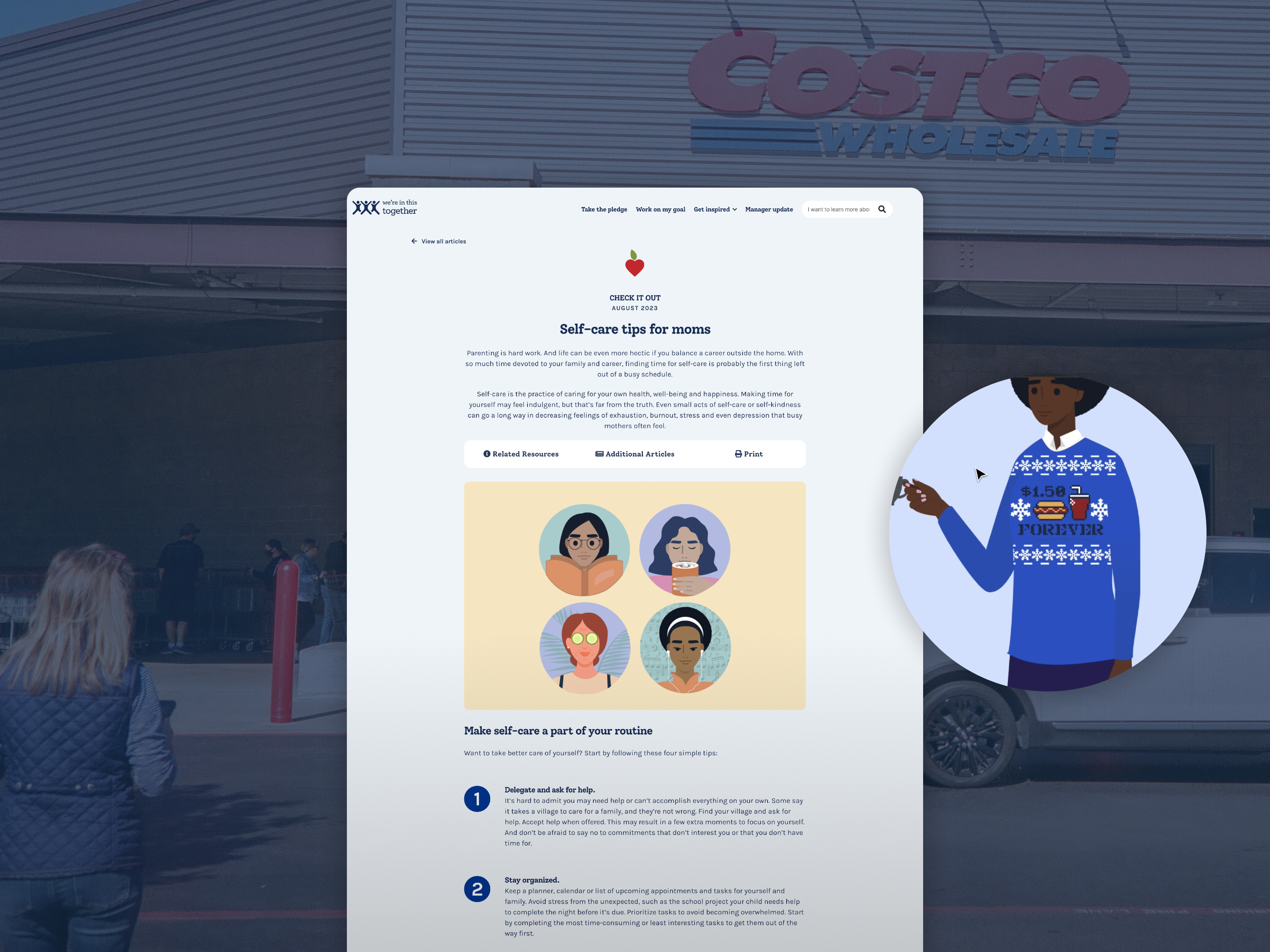
As part of Aetna’s team servicing Costco, I joined to help market the benefits Aetna provided to Costco employees. One of the significant efforts was the “We’re In This Together” Pledge, housed within their wellness portal. This portal included the pledge experience, testimonials, and other content, along with the email marketing design that drove traffic to it. Although the new website had just launched in 2021, I was brought onto the team to assist with day-to-day content and layout design work, as well as roll out new features for 2022 and beyond.
Email design process
Cost Savings, Same Results
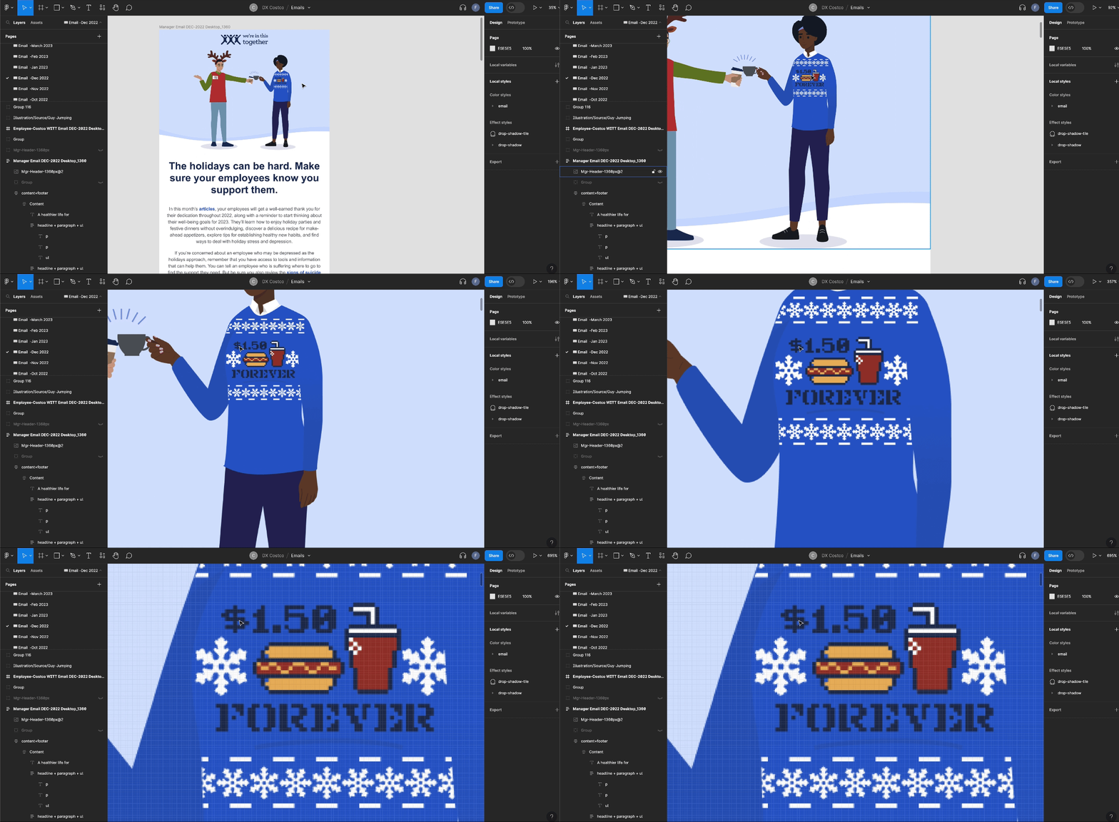
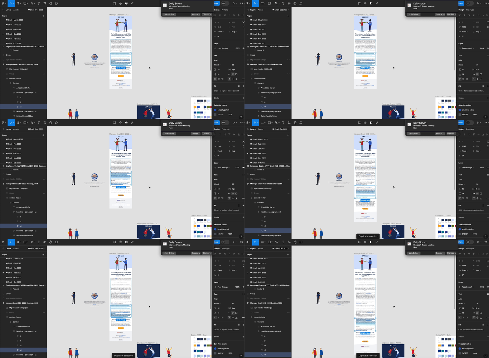
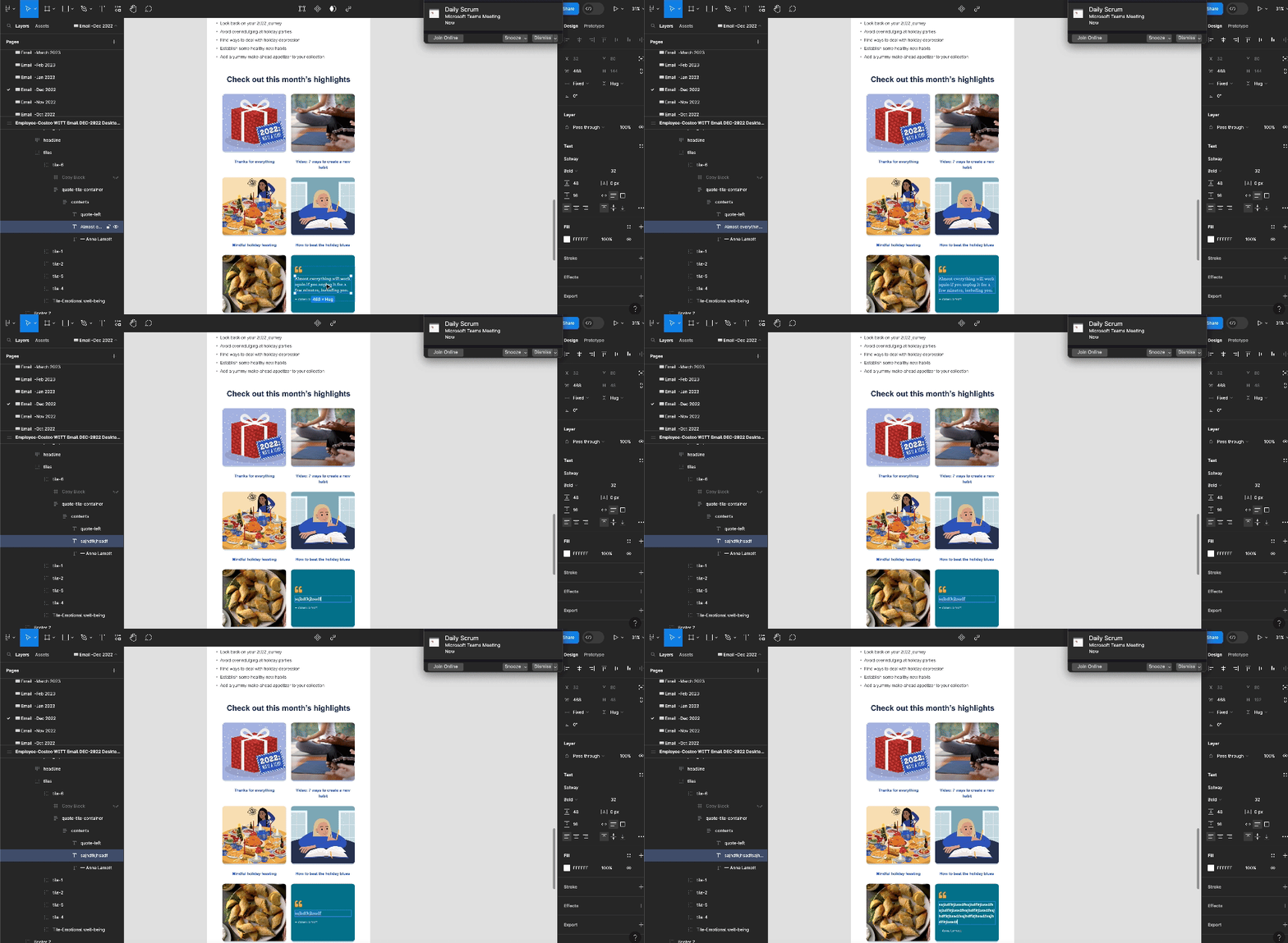
I hate busy work. That’s why I love creating reusable components in Figma. When I took over the email design process as designer, I transformed the clunky, labor-intensive mockup process into a streamlined workflow. With just a few hours of extra work upfront, the process ended up saving over 96 hours of work throughout the year.
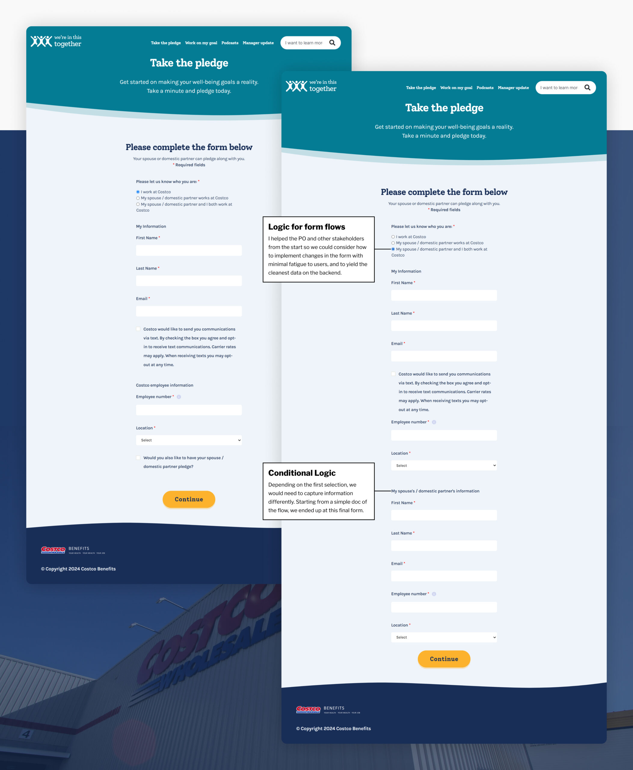
Partner Pledge Sign-Up
I worked closely with my Product Owner and stakeholders on the logic for populating form fields, enabling users making a pledge to also add their partner to the pledge.
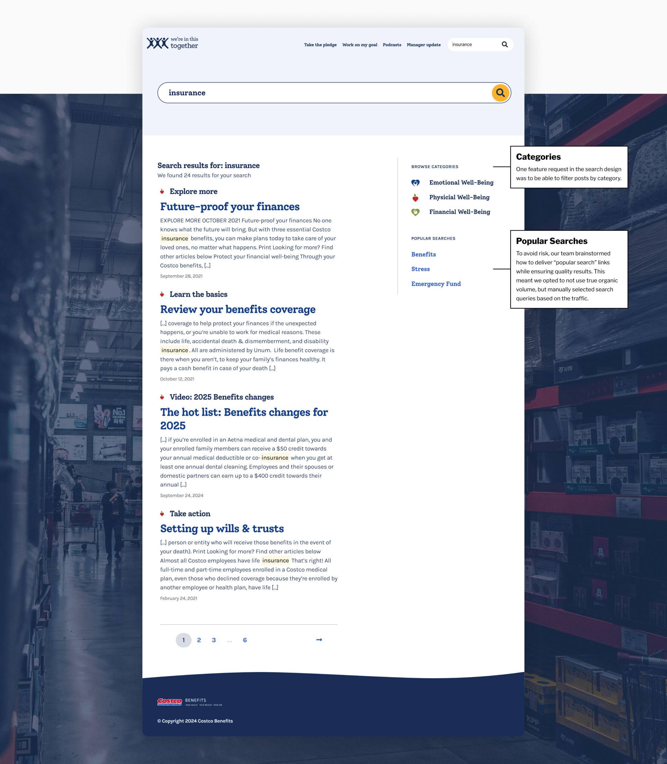
Search, Filtering, and Categorization
As a designer, one key task was taking ambiguous ideas for new features and refining them into concrete, actionable plans.
Filtering and Categorization
I collaborated with the PO and other stakeholders to identify a more specific feature set. I value the partnership to get specific definitions for what we wanted to build rather than running off as an individual contributor with a vague prompt.
Search Feature
Similarly, I partnered with stakeholders to define a clear feature set, ensuring we built a search functionality that met users’ needs.
Bridging Design and Development
Collaboration and Component Library
Challenge and Action
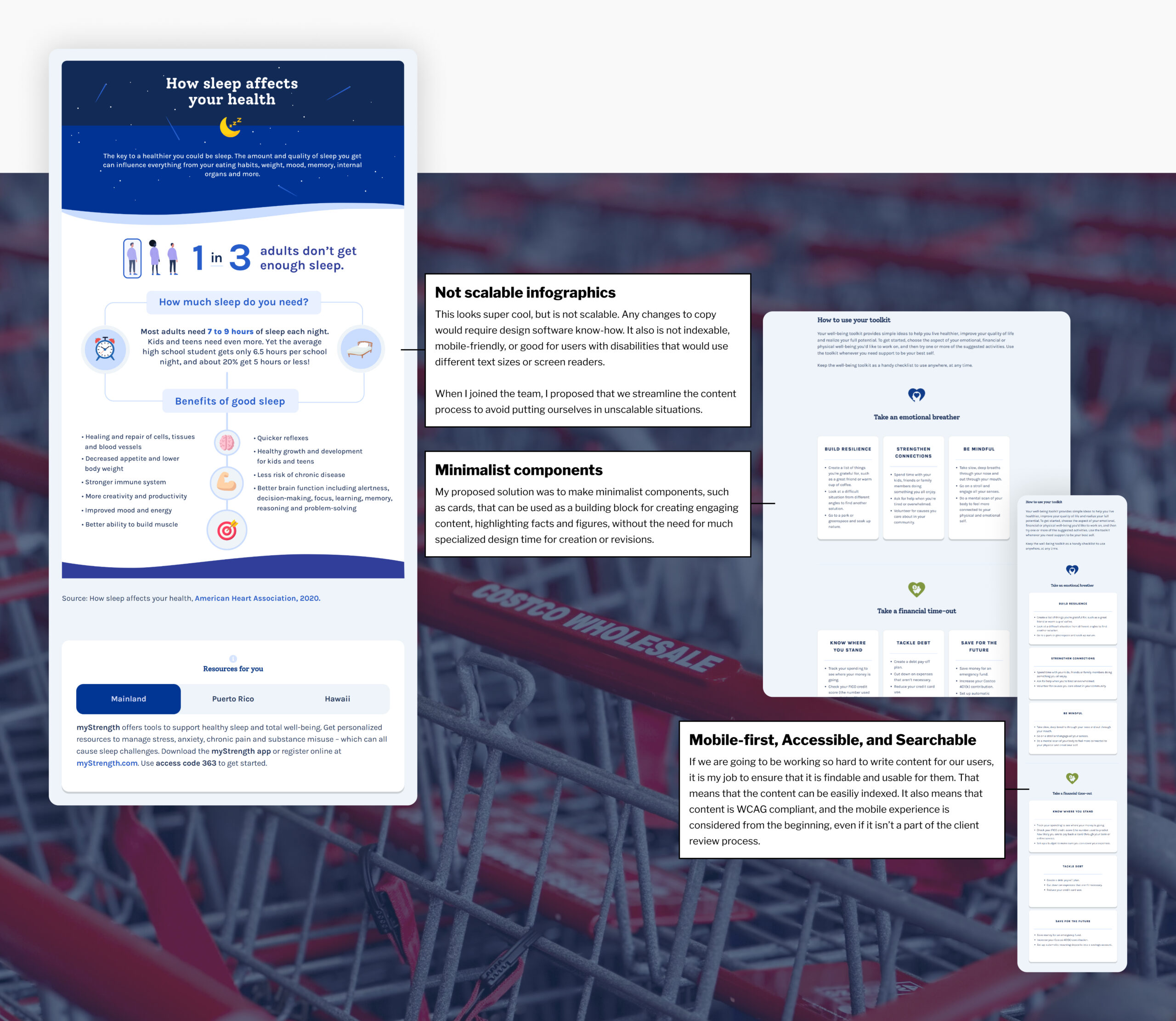
Working closely with developers was crucial for this project. Instead of “throwing designs over the wall,” I engaged in collaborative discussions to ensure our designs were feasible and optimized for implementation. My familiarity with the architecture of WordPress websites, including post types, categories, tags, menus, and various frameworks, allowed me to have meaningful conversations about how the user experience could be enhanced not just for end users but also for those on our team populating the content.
I led the charge on this idea, resulting in an accessible, searchable component library that was mobile-friendly, eliminating issues with super small text. This approach resulted in a menu of options that facilitated better connections between stakeholders, content writers, designers, and developers.
